
Some Ad Outakes for Your Consideration
Sometimes concepts that don’t make the cut hold their own appeal.
In a few weeks an ad for SSCS will appear in Retail Merchandiser (RM) magazine. We’re pretty happy with how it turned out, and we’re pleased that it will appear in conjunction with a great feature story RM did on Nittany MiniMart, a customer of ours.
We won’t sneak preview that ad ahead of publication—no one dislikes spoilers more than us—but we’re taking this opportunity to show you the contenders that didn’t make the cut.
Almost every time we work up an ad for electronic or print publication, the creative team submits a few different options to the marketing committee for review. Design and message are debated until we agree on an approach.
Each of the concepts we’re presenting here merited at least a little consideration, but for some reason or another fell short in comparison to the eventual winner.
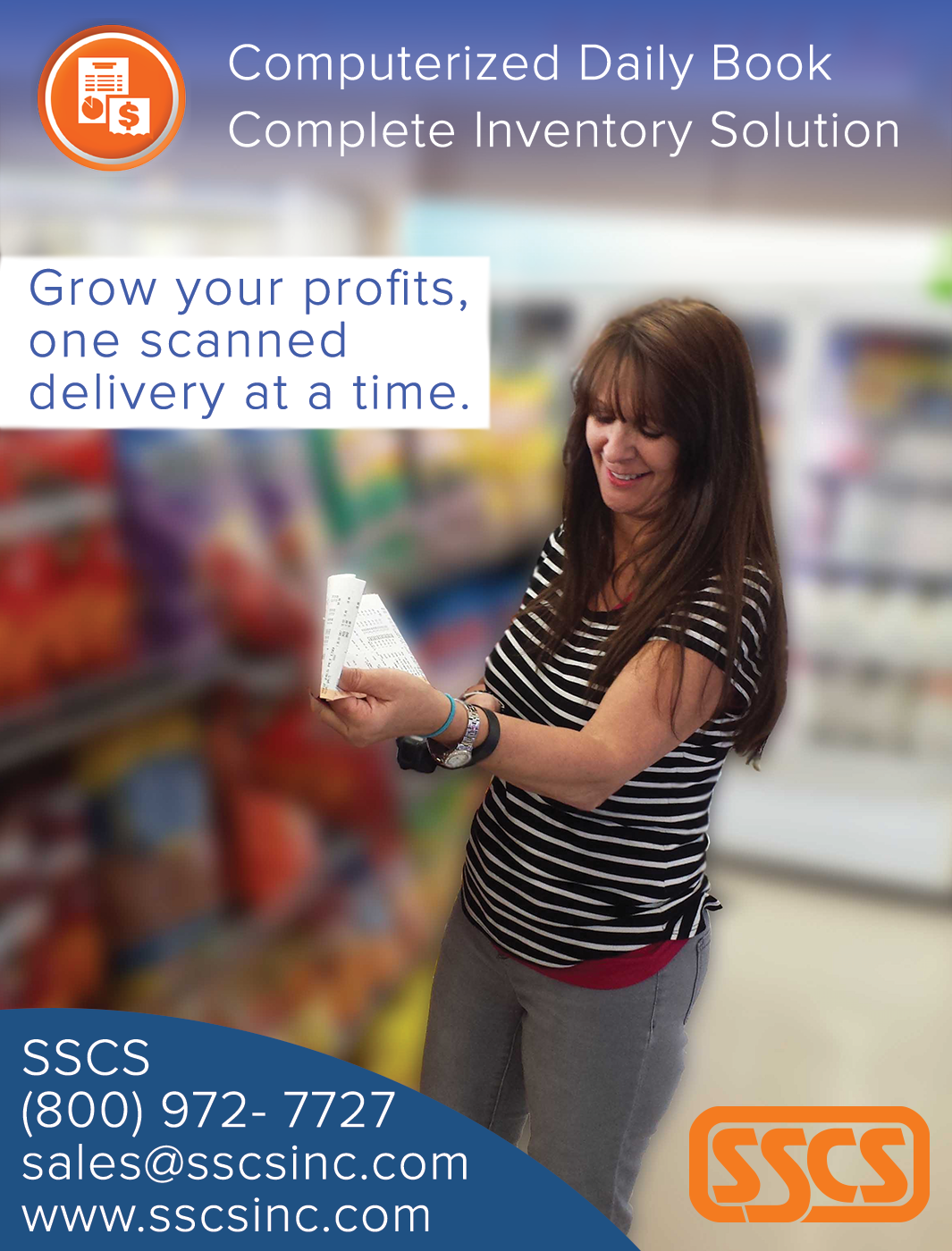
For this project, the creative team suggested we start with a photograph over which we could layer words and graphics. Practicality motivated us: when we rolled out the last version of our website we couldn’t use all the photos that were submitted to us and approved. We also thought some of the images we did use on www.sscsinc.com could look striking when reimagined in an ad.
Such is the image at the top of this post. It currently appears on the Power Price Book product page of our website, but wanted to thought a scanning “action” photo might work well in a different setting. At full length the image does capture the eye, but we ultimately decided to promote another type of SSCS software.
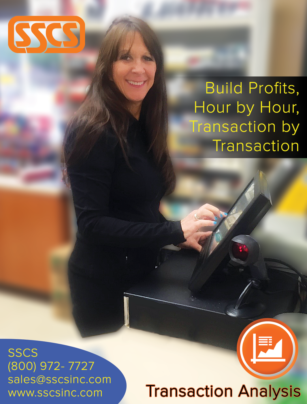
Our second ad features the same customer behind a POS. Since the POS is the transactional heart of the convenience store, it made sense to tie this image into our Transaction Analysis software which is composed of tools and reports that provide powerful and detailed analysis of what goes on at the store. The problem with this ad is that the photo wasn’t crisp enough. So though we liked it, we ultimately passed.
The third and final option doesn’t feature a human being, but a striking interior shot of a Tahoma Market site, another customer of ours. Though some felt strongly that having a human being in the shot would work better, the creative team felt obliged to try a treatment without one. This photo is somewhere on our website (quite honestly we forgot where), and the fountain as a standalone island is quite striking. Since it is of Tahoma Market, we thought it only fitting to include a testimonial from that organization in the mockup. Here’s how it turned out:
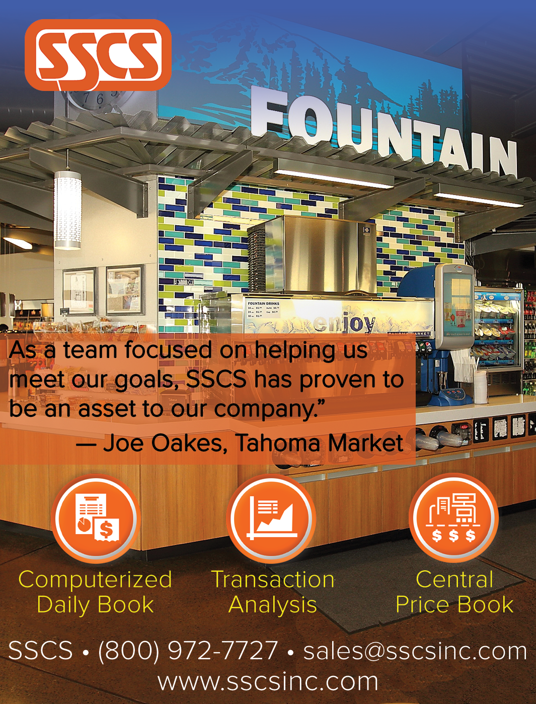
Frankly, we were a little worried that the testimonial box took away from the grandeur of the interior, but we didn’t have a lot of options for placement. We certainly didn’t want to obscure that wonderful blue at the top that adds distinction to the image. Ultimately, however, it lost out because of its lack of a human element.
Do you have any opinions of what works best in the above? Shoot us a comment if you are so inclined. When the issue of Retail Merchandiser featuring the ad finalist gets published, we’ll give you a heads up.


Recent Comments